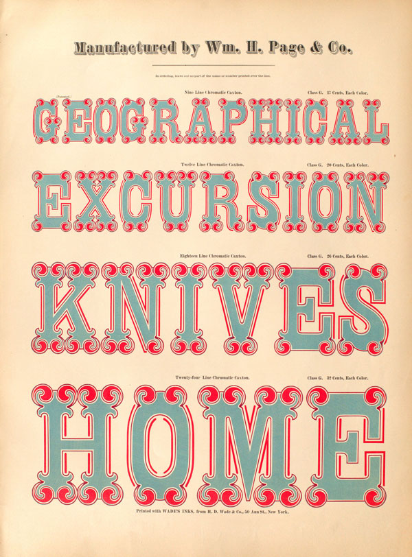
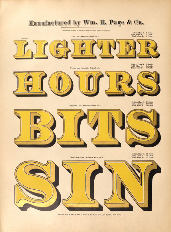
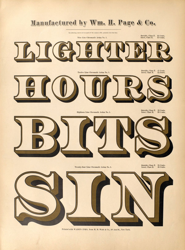
In the world of typography, few titles hold higher esteem than William H. Page’s Specimens of Chromatic Wood Type (1874).
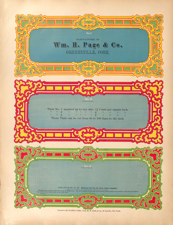
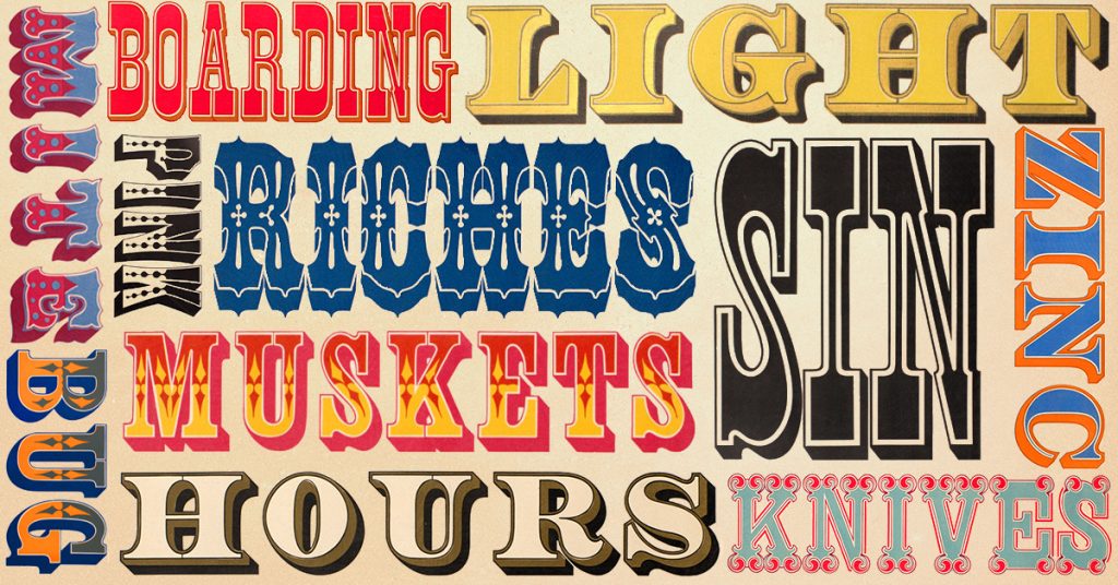
Having procured a cult-like following in the modern field of design, this extraordinary volume is brimming with over 100 intricate typeface examples, all skilfully produced and vibrantly coloured. The elaborate fonts boast up to seven colours, each with labyrinthine borders and bold outlines. First produced in 1874, the book was intended as a catalogue to showcase the capabilities of Page’s world-renowned wood type foundry, William Page & Company, to sell the pieces of type to other printers.
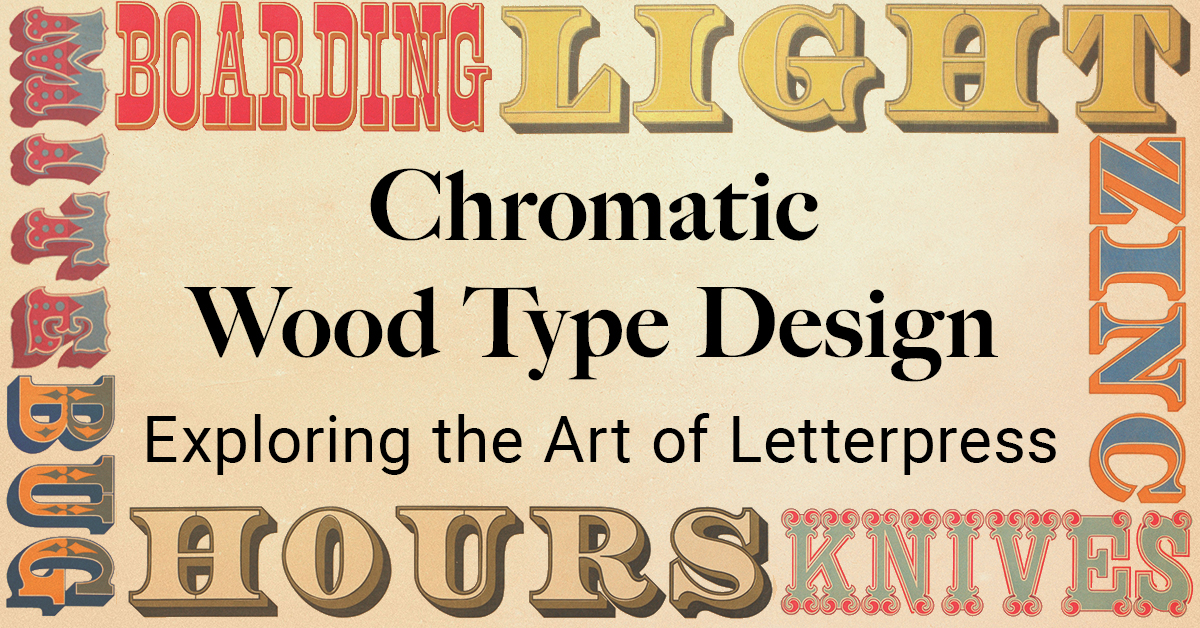
Chromatic Wood Type Design

The History of Wood Type Design
The style of printing, known as Chromatic Type, was developed by Edwin Allen in the first half of the nineteenth century. Chromatic Type utilises layers of graphic colour to present a unified effect on the page. Using intricately carved wooden blocks, each letter is built up through multiple forms, artfully blending on the surface to create a rich and harmonious character design.
The history of moveable type printing dates back to ninth-century China, credited to Chinese inventor Bi Sheng (990–1051 AD) where fragile pieces of baked clay were used for the letters. Wooden moveable type was later developed by Chinese engineer Wang Zhen (1271–1333 AD) as a more durable option for printing text. The hand-carved letters that could be moved and rearranged, then printed in relief to make individual words. Towards the beginning of the nineteenth century, the traditional technique was developed so the work was less time-consuming and could be easily duplicated. In Europe, it became a popular way to print large display typefaces for posters.
A commercial method for wood type printing was established by Darius Wells in 1827 when he created the lateral router with David Bruce – a machine to mass produce and print the carved letter blocks. This modern method of wood type printing spurred the first ever type specimen book produced by Wells’ own print company, D. Wells & Co., a year later. At this time, some of the most iconic type styles had been developed, including sans-serif, slab serif, and fat face that are still in use today. The popularity of intricate typefaces soared with the arrival of the printed poster. By the mid-1800s, a large populous of wood type manufacturers had been established across America, with William Page & Co. as the industry’s front runner.
William H. Page
Page, born March 24th 1829, learnt the printing trade as a young man. After working in the field for most of his adult life, he established his company in 1859, along with his partner Samuel Mowry, in Norwich, Connecticut. Together, the pair built a successful printing foundry with an impressive catalogue of original typeface designs. They became one of the biggest printers of wood type in the US, and were unrivalled for many years with their bold character, multicoloured designs, and intricate frames. It wasn’t until the 1880s that serious competition appeared in the form of the Hamilton Manufacturing Company, run by J. E. Hamilton. After nearly three decades of dominating the world of wood type print, William Page sold his business to his rival in 1891. The production of chromatic wood type fell out of style in the early twentieth century when new machine printing was introduced with the ability to mass-produce type for newspapers, magazines, and posters.
Creating Specimens of Chromatic Wood Type
While the turn of the century saw wood type overtaken by significant industry developments, Page’s colourful tome lives well beyond the lifespan of his business. The old printing technique has regained popularity, with modern artisans reviving the craft. The multi-layered designs have since become a trademark of typographical design. Specimens of Chromatic Wood Type remains admired among those interested in typography and design as a stunning example of the technique, with many still utilising its bold, circus-style typefaces for inspiration.
As well as its aesthetic popularity, the volume has also come to be seen as something of a poetic riddle. While the collection of typographical designs was intended to showcase form and skill, the words used can also be read as abstract lines of poetry. Whether purposefully organised in that way by its makers, or a product of simple coincidence, the random sequences of text throughout the book provides a humorous read to those browsing the type styles. Lines like ‘detriment prison unite’, ‘numerous stolen mind’, and ‘sour drink boarding Belgian’ add further layers of novelty to this delightful celebration of form and colour.
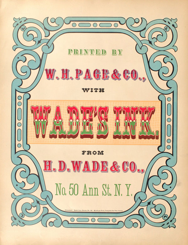
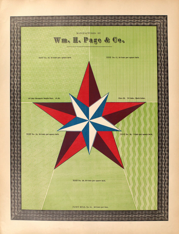
Preserving Specimens of Chromatic Wood Type
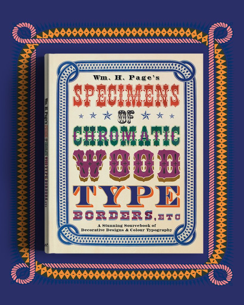
In this new facsimile edition, we have taken meticulous steps to preserve the original colour plates of the iconic volume, ensuring that the charm of Page’s typographical masterpiece remains true to the original, first printed over 175 years ago. This prolific volume showcases the artistic magic that lies at the heart of letterpress printing in a rich celebration of a once-forgotten craft.
Discover more of our beautiful volumes
